UI / UX Design

emoods insights
developer: Yottaram
I partnered with Yottaram to lead the design and front-end development of a robust web and mobile app, eMoods. eMoods Insights is a mood and symptom tracker that lets you easily chart your daily highs and lows, sleep, medications, and other symptoms related to common mood disorders. My contributions to this project included:
Designed the user interface and experience for the client-facing web-app including a customizable and fluid dashboard, mood logging screen, automatically generated charts, calendar, and accompanying marketing pages
Designed a full mobile version of the Insights app for iPhone and Android devices
Developed all brand assets and created cohesive yet distinct visual identities for distinct eMoods products
Front-end web development and QA testing


emoods Wellness Tracker
developer: Yottaram
At the beginning of the Covid-19 pandemic, the eMoods team wanted to find a way to help people take care of their mental health in the face of isolation during a crisis. We adapted the eMoods app, originally created for people living with bipolar disorder, to center on the problems that we were now all facing. We broke down the tracking points into three basic categories: a daily check-in, health and self-care, and mental and social stimulation.
Designed the user interface and experience for the client-facing mood logging screen, automatically generated charts, calendar, accompanying marketing pages and social media content.
Developed all brand assets to be cohesive with, yet distinct from, the original eMoods app, including alternate icons


case studies

path for life
studio: we are how
creative director: tamara connolly
This case study included working with a well respected licensed nutritionist to bring the unique program that she designed for her clients to a broader audience on the web. We developed from the ground up a subscription-based web app with an integrated payment system and accompanying lifestyle blog. My work on this project included:
Designing and illustrating custom infographics, charts, and supplemental program materials
Expanding upon existing branding to accommodate print materials, web assets, an email campaign, and social media assets
Design and front-end development for the self nourishment web-app
Designing and developing a custom Wordpress theme for the lifestyle blog


jeffrey frank wacks memorial fund
studio: we are how
creative director: tamara connolly
This unique project combined a complete rebranding of an existing organization with an overhaul of their website and online donation system. A hand-lettered logo and custom textures were inspired by the artwork of the nonprofit’s namesake. The website and donation portal were built from the ground up, requiring an easy to use, friendly UX design that would be simple for existing donors to transition to. My work on this project included:
Creating the hand-lettered logo and accompanying brand assets as well as developing the brand guidelines
Designing marketing materials, email campaigns, program brochures, and event materials and signage
Design and front end web development for the fund’s new website and donations portal


irrelationship
studio: we are how
creative director: Tamara connolly
This comprehensive branding project included a hand-lettered logo, complete stationery suite with brand guidelines, custom illustrations, infographics, and website.
Logo development and design including final execution of hand lettered logo
Design and development of a custom Wordpress theme for the Irrelationship website and blog
Illustrations and hand drawn infographics for use across web, social media, and print applications


bitter & esters
studio: we are how
creative director: tamara connolly
In order to brand this homebrew supply shop, our team started with deep market research into peers, competition, and the craft beer and homebrew culture. It culminated in a unique name and logo, a fully branded custom Wordpress theme, a suite of lush illustrated patterns inspired by the logos imagery, beautiful bottle labels, gift cards and other print collateral.


the center for mindful awareness
studio: we are how
creative director: tamara connolly
This brand update expansion included research into the center’s roots and who they serve, and develop a series of illustrations and graphic elements that could be used across various materials for students and teachers. My contributions to this project included:
Design and development of the center’s new website
Logo updates and design of supporting branding elements and illustrations including mindfulness keytags and student achievement certificates.


print collateral
merrimack college
studio: we are how
creative director: tamara connolly


UN Foundation
studio: we are how
creative director: Tamara connolly
Selections of work done for UN Foundation campaigns, including Nothing But Nets, GirlUp, Shot@Life, Clean Cookstoves Initiative, and MAMA that spanned illustrations, publication design, poster designs, infographics, and other promotional materials.


logos + branding
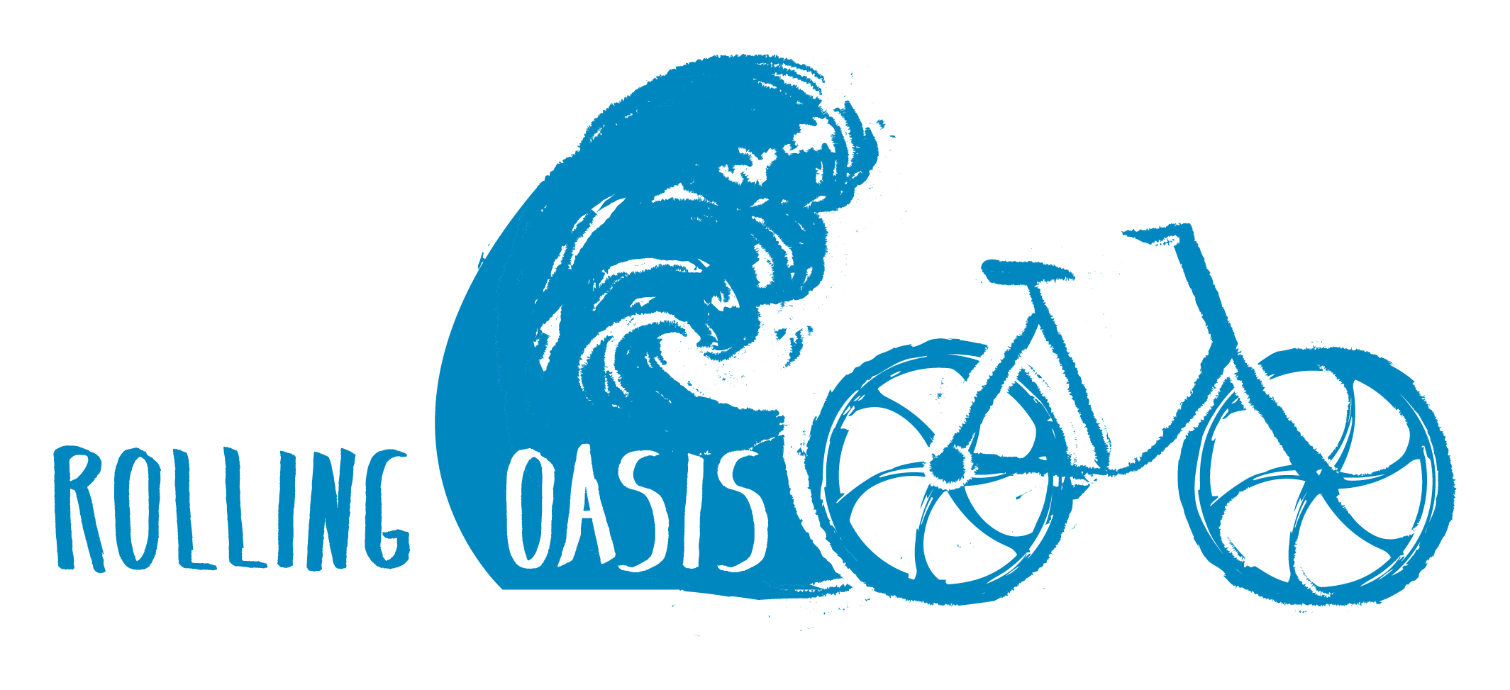

rolling oasis
This branding project for a new local business centered around illustrating a fresh and energetic logo that would help guide their brand. Bicycle-driven refreshment carts travel along Seattle-area hiking and cycling trails, offering on-the-go snacks, drinks, and water stations.

a wild life tarot
A logo design project that called for a hand drawn illustration teeming with plant-life and crystals accompanied for a tarot business with big plans for growth.
garden and gather
A small independent florist from Frederick, MD wanted a lush custom illustrated logo featuring her favorite local flowers.

story machine
A brand development and logo design project that included a hand illustrated logo with custom typography and a comprehensive brand guidelines document (excerpt below) for future development.


motion graphics
global mom relay
studio: we are how
creative director: tamara connolly
This motion graphics piece debuted live during a kickoff event on the Toshiba screen in Time’s Square to introduce a unique initiative combining four campaigns working together to help women and children across the globe lead healthy lives. Global Mom Relay leveraged social media and a global network of mothers to build awareness of health and wellness issues worldwide, inspire action, and generate donations for public health campaigns. We Are How created an identity for the Global Mom Relay that honored the separate initiatives receiving donations while building a unique and memorable identity for the Relay itself. My contributions to this project included development of the branding for the Relay’s web presence, a “popup” site to promote the campaign, and the motion graphics feature to kick it off.


shot@life
studio: we are how
creative director: tamara connolly
This motion graphics project for shot@life required a brand development for what would become an annual tradition called blogust: blog relay for good, an initiative that would unite mothers across the world to increase awareness and accessibility to vaccines. My work on this piece included development of the initiatives branding and execution of the animations and motion graphics.

applied illustration

mini-game graphics and concept art
game: dragon dad
developer: tiltfactor
https://tiltfactor.org/game/dragon-dad/
“Your strict dragon father has chores for you. Spoiler alert: no matter how well you do, he’ll never be satisfied. Complete each minigame as fast as you can, but they’re going to get harder and harder until you leave your father disappointed.”


“happily hydrated” hair
client: Porter Novelli for Panasonic
This project for Panasonic included 6 spot illustrations used on a custom box design and lookbook to highlight and promote their new nano hair straightener.


“we are how” team portraits and spot illustrations
client: We Are How
creative director: Tamara Connolly
This project for We Are How, a design studio based in Jersey City, NJ, included 6 detailed portraits and 3 spot illustrations for use on the studio's website.


levelguide illustrations
client: levelware
These illustrations were commissioned to help introduce Levelware, a website that simplifies the process of negotiating contracts between entrepreneurs and their clients.


